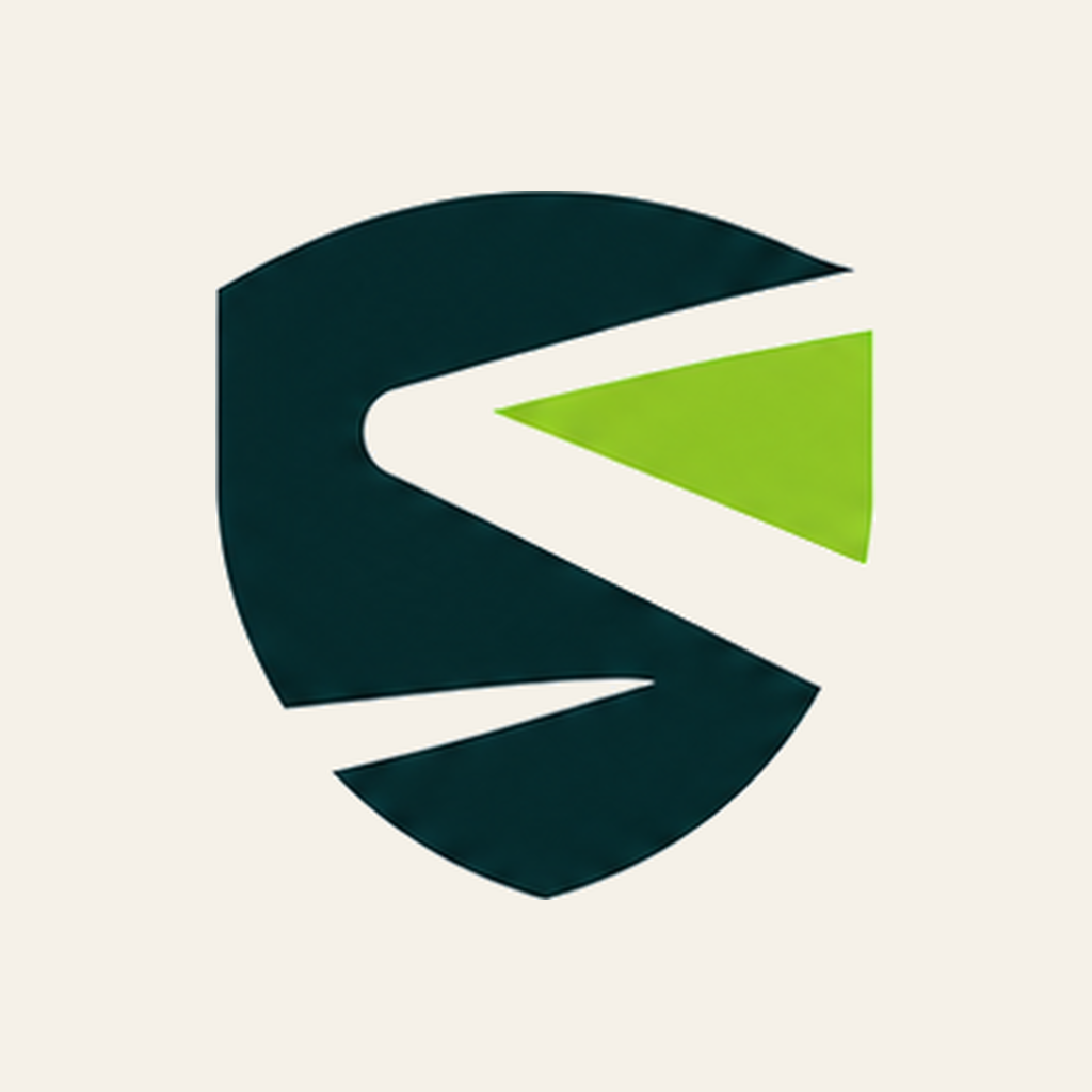
02 · Logo System
The mark
A forest-green shield housing a stylised “S” with a lime accent. The shield evokes protection and trust; the lightning-cut S signals speed and decisive action. The wordmark pairs “Shadow” (the quiet, careful work) with “biz” in lime (the visible business outcome).
Primary lockup

Variants
shadowbiz-light.png · use on cream / white

shadowbiz-dark.png · use on dark teal / black

shadowbiz-mono-black.png · single-colour print, light bg

shadowbiz-mono-white.png · single-colour, dark bg
Mark only (shield)

mark-light
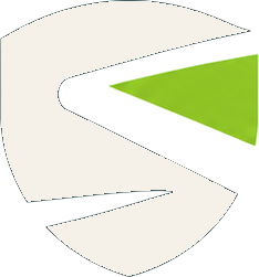
mark-dark
on lime accent
on ink
Do
- Use approved colour variants for each background
- Maintain at least the shield’s width as clear space
- Use SVG / high-res PNG for crisp display
- Minimum size: 24px wide on web, 8mm in print
Don’t
- Stretch, skew, or rotate the logo
- Add shadows, glows, or 3D effects
- Place on busy photo backgrounds without a solid plate
- Recolour the lime accent or shield independently